Australia’s Great Barrier Reef is a UNESCO World Heritage Site as well as one of the Seven Natural Wonders of the World, hosting the world’s largest coral reef system. The goal of this identity system is to engage and educate an audience of tourists. I began by exploring the ecological, cultural, and environmental significance of the Great Barrier Reef: It spans over 2,300 kilometers and supports thousands of marine species; it is also home to the largest population of dugongs, a threatened species of sea cow. The Reef is not only a biodiversity hotspot, but also a symbol of natural cycles and fragile ecosystems under threat due to climate change and pollution.

My initial sketches featured corals, sea turtles and dugongs but I ultimately chose the dugong as a more unique and locally specific symbol, unlike the more generalized sea turtle, which is commonly used in reef-related imagery.
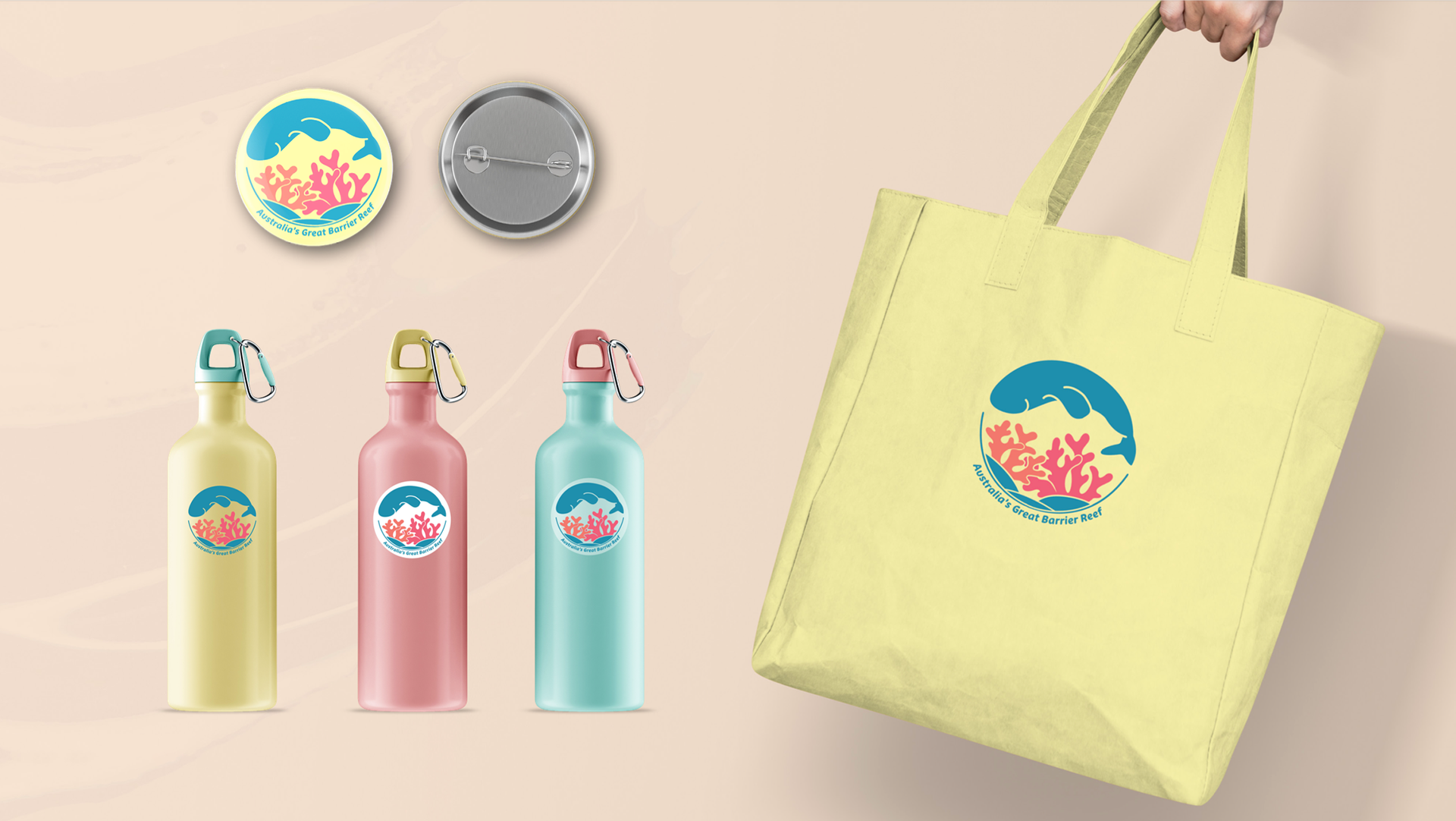
The final logo features a circular dugong icon, evoking both the shape of a bubble and the cyclical nature of marine life. For typography, a rounded sans serif font was selected to match the organic, natural forms found underwater and to convey a friendly, human-centered tone. The color palette was inspired by the reef itself, pulling directly from the reef’s natural environment.


The business card design process began with exploratory sketches that combined imagery, graphic elements, and dynamic curves. After refining the concept, I chose softer wave forms in the final design to evoke a peaceful, immersive feel, better reflecting the brand’s tone and the natural beauty of the reef.


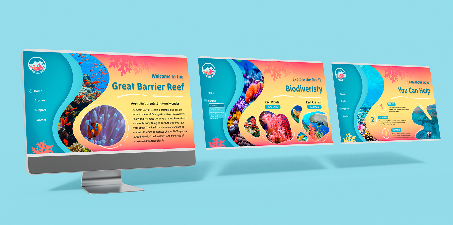
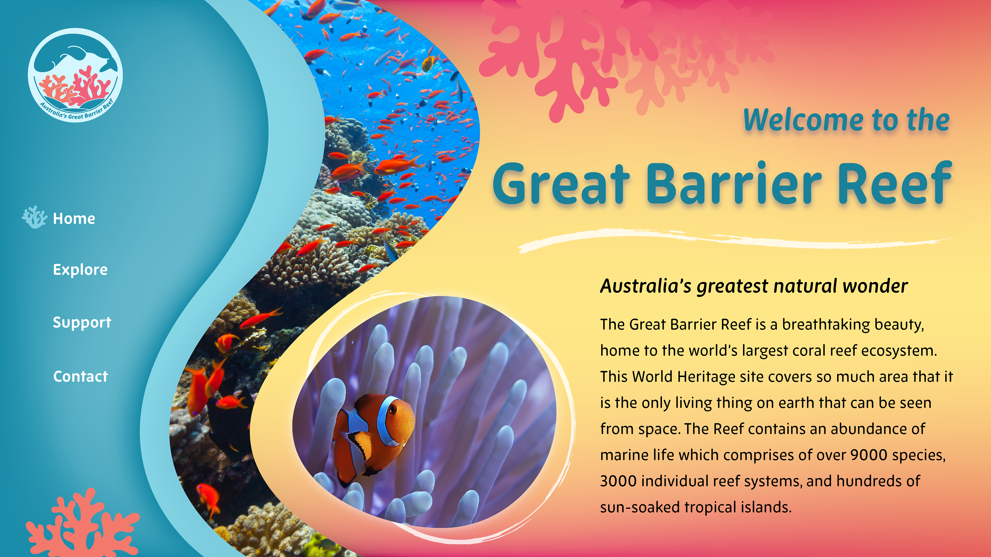
From there, I extended the brand across multiple platforms, developing website landing pages and a social media presence through a Twitter page to engage audiences digitally. I also designed a set of merchandise including stickers, a pin, tote bag, and reusable water bottle, geared toward tourists as memorable, functional keepsakes that reinforce sustainable travel and environmental awareness.