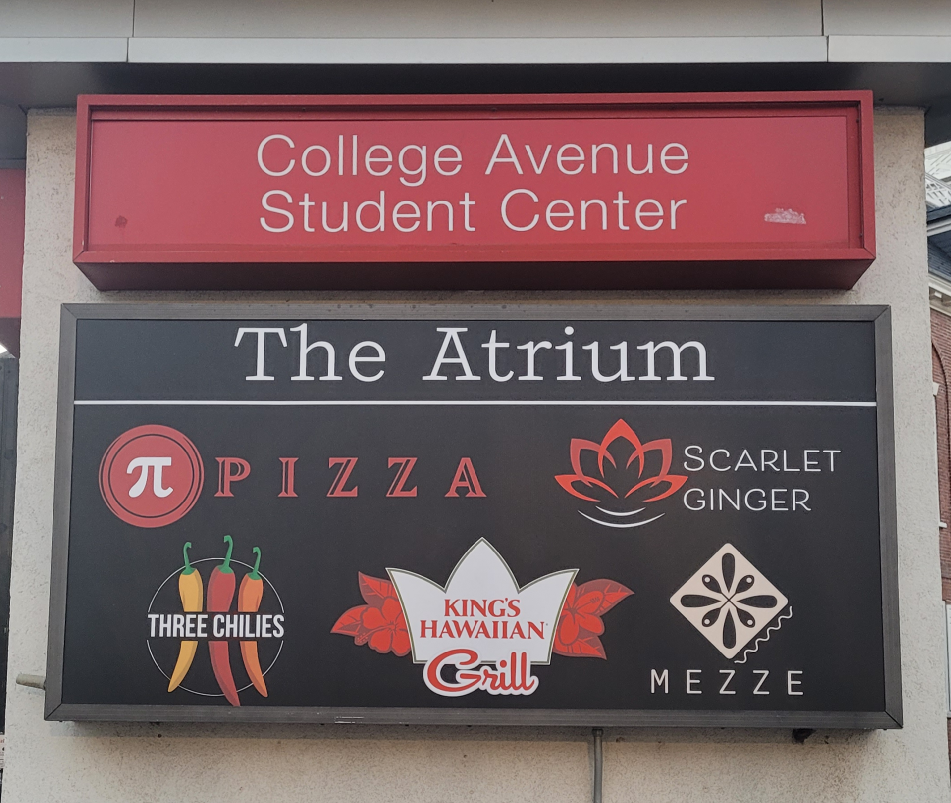
For this project, I was tasked by Rutgers Dining Services in creating a sleek, modern, and youthful brand identity for a new Asian fusion restaurant set to open in the College Ave Student Center Atrium. The initial client requirements were to incorporate a lotus flower and the name Scarlet Lotus.

In the initial sketches, I experimented with different lotus icons with varying stroke styles and treatments as well as a mix of serif and sans serif fonts. The color palette centers around red and black—two powerful, intentional choices. Red holds deep cultural significance across many Asian traditions, symbolizing prosperity, celebration, and good fortune. It ties the brand back to its cultural roots in a visually striking way. Black serves as a stark contrast, grounding the vibrant red while adding a sleek, contemporary edge that aligns with the restaurant's modern fusion identity.
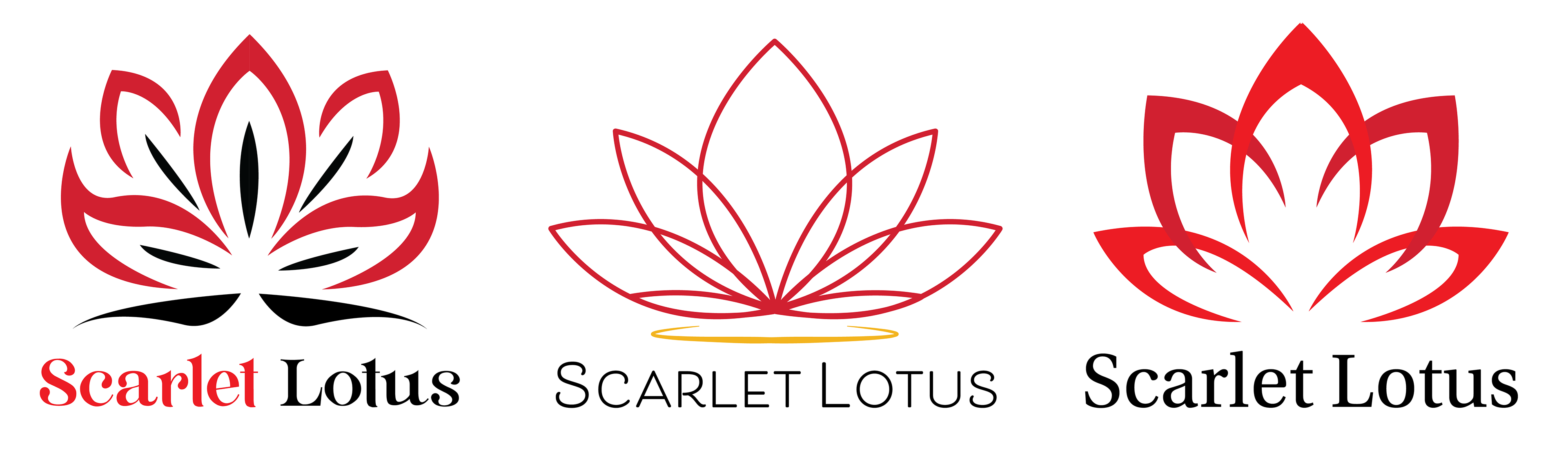
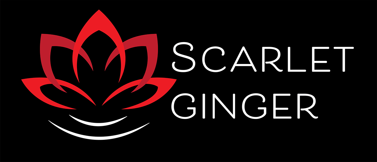
The final logo was chosen for its simplicity and refined curves. Against a black background, the simplicity of the form allows it to feel sophisticated without being overly complex. Additionally, a last minute name change was requested, switching Scarlet Lotus to Scarlet Ginger.

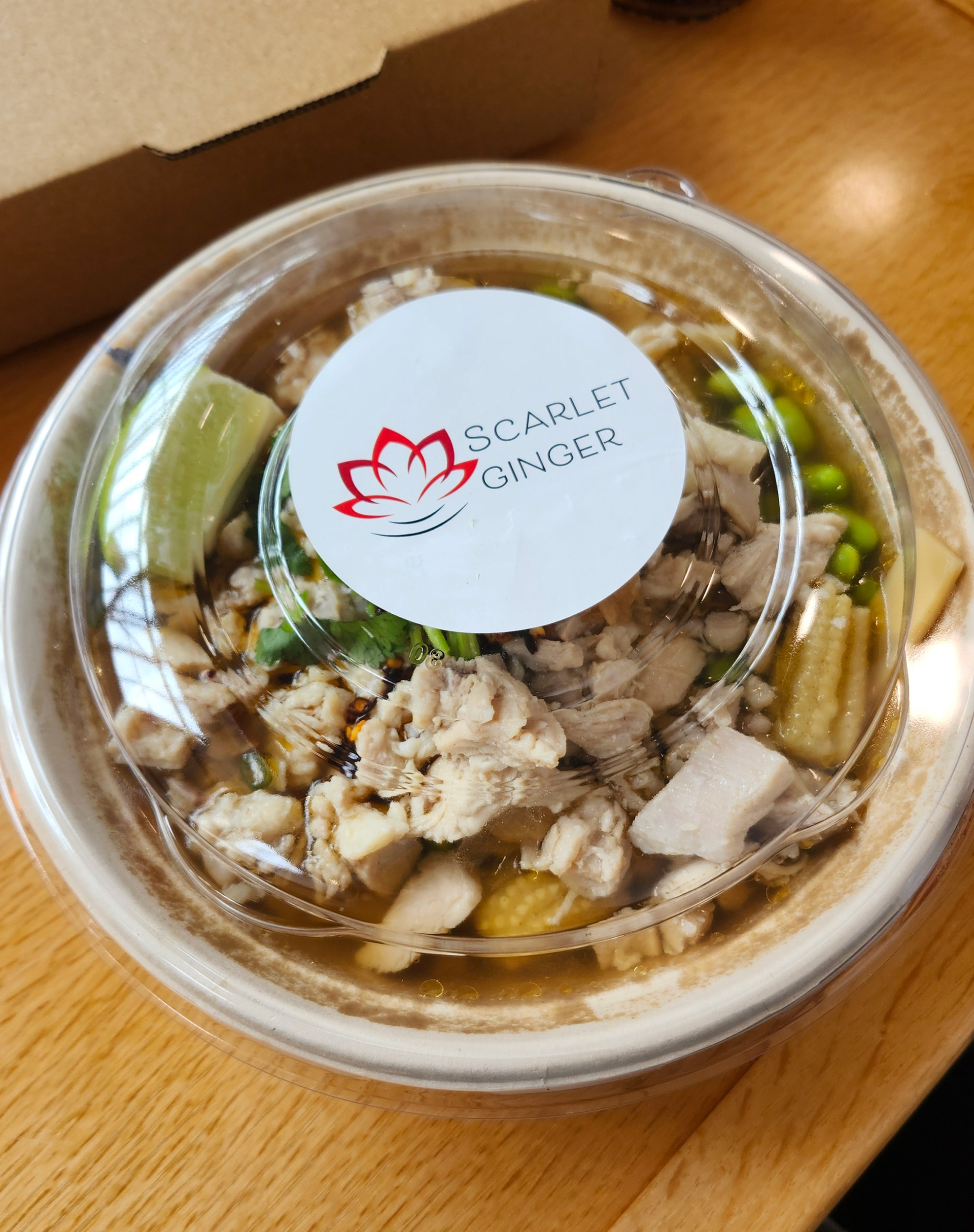
This identity stands as a vibrant, contemporary brand that reflects both the cultural roots and the innovative spirit of Asian fusion cuisine, enhancing the visual diversity of the atrium.